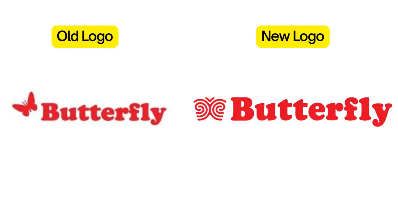
The refreshed identity features a fingerprint blended with butterfly wings, symbolising individuality and transformation.
Butterfly, the well-established kitchen appliance brand, has revealed a new brand identity designed to resonate with evolving consumer values and lifestyles. Central to the refreshed identity is a striking new logo that merges a fingerprint with butterfly wings-capturing the essence of individuality, authenticity, and transformation.
This shift marks more than a visual overhaul. Butterfly is reorienting its brand philosophy to connect with consumers who embody a ‘zillenial’ mindset-those who embrace change while staying rooted in their true selves. Rather than focusing on traditional age-based demographics, the brand now targets attitudes and behaviours that reflect openness, adaptability, and self-expression.
“For over 40 years, Butterfly has been a part of millions of kitchens across India. Today, as homes become more fluid and identities more self-defined, our new identity reflects not just who we are-but who we’re here for,” said Swetha Sagar, Chief Business Officer, Butterfly.
“This is more than a rebrand. It’s a reimagining of what it means to belong in a modern Indian kitchen. Butterfly is for the originals-those who grow, shift, and evolve, yet remain true to who they are.”
As part of the rebranding, Butterfly is also upgrading its product lineup-including mixer grinders and cooktops-with an emphasis on modern design, improved usability, and long-lasting durability. The move aligns with the brand’s commitment to staying relevant in today’s dynamic households while honouring its legacy of quality and trust.