Birla Tyre has announced a comprehensive brand revamp with the launch of a new logo and website, signaling its renewed vision under the stewardship of new promoters Himadri Speciality Chemical and Dalmia Refractories.
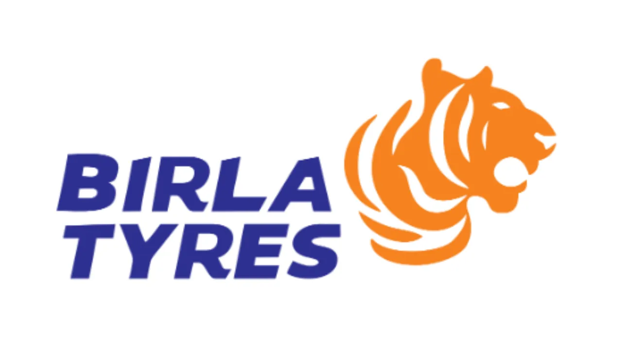
The refreshed brand identity features a custom wordmark designed to convey speed and motion, paired with a tiger symbol that embodies strength, agility, and forward momentum. The updated colour palette-blue and orange-underscores the brand’s renewed focus and dynamic presence in the mobility sector.
A Reaffirmation of Purpose
A company spokesperson shared,
“This rebranding is more than just a visual update; it’s a reaffirmation of our commitment to purposeful growth and innovation. The new logo reflects Birla Tyre’s core principles: a legacy that inspires boldness, a product portfolio built for the future, and a steadfast drive for continuous improvement. It signals our readiness to meet the evolving needs of the automotive industry with energy, innovation, and intent.”
What’s Next
To support this transformation, Birla Tyre plans to launch integrated marketing campaigns across digital, television, print, and outdoor platforms. The objective is to enhance brand recall and engage both modern and traditional customer segments.
This rebranding marks a new chapter in Birla Tyre’s journey as it gears up to expand its footprint and relevance in a rapidly changing mobility landscape.