The makeover includes a new jingle, brighter packaging, and bolder visuals designed to make the brand as craveable as its pizza.
Just days after Pizza Hut revealed its brand refresh, Domino’s Pizza rolled out its first major refresh in 13 years, aiming to make every touchpoint as irresistible as the pizza it serves.
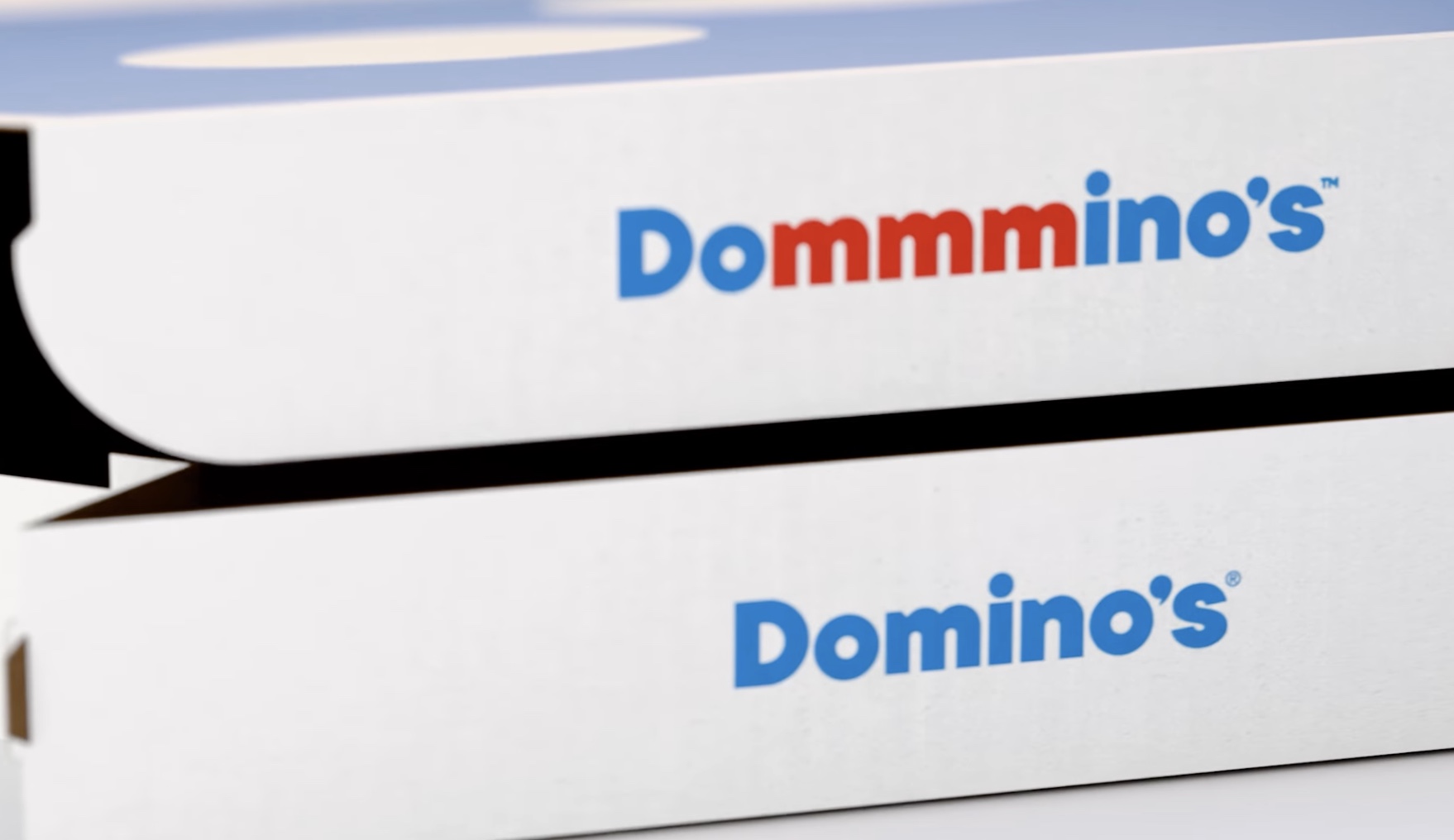
The refresh introduces hotter, more vibrant colours, bolder typography and graphics, and brighter packaging. A new playful jingle, “Dommmino’s,” sung by Shaboozey, adds an audible layer of brand identity, designed to make customers hum along. Music, visuals, and messaging across the brand have all been infused with a sense of craveability.
The updated look will gradually roll out across TV and digital campaigns, dominos.com, the Domino’s app, in-store graphics, packaging, print materials, and team uniforms, both in the U.S. and in international markets.
Kate Trumbull, Executive Vice President & Global Chief Marketing Officer, Domino’s, said:
“Over the past decade, we became known as a technology company that happens to sell pizza. With our Hungry for MORE strategy, we’re bringing the focus back to making and delivering the most delicious products and experiences – exactly what our customers crave. Instead of a traditional tagline, we’ve baked craveability right into our name and every aspect of our brand. You literally can’t say ‘Domino’s’ without saying ‘mmm.’”
Trumbull added:
“Most companies rebrand when they’re struggling. But after years of category-defying growth, this refresh is about pushing ourselves to be the best version of Domino’s – bold, craveable, and memorable.”
The refresh signals a renewed focus on product, experience, and brand personality, reinforcing Domino’s position as a pizza brand that’s both modern and irresistibly delicious.