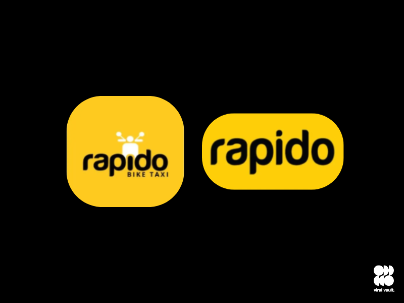
Rapido has unveiled a refreshed brand identity, replacing its earlier bike-centric logo with a modern wordmark design, signaling its transformation from a bike-taxi service to a comprehensive mobility platform. The new identity reflects Rapido’s evolution into a multi-modal ecosystem that goes beyond two-wheelers to include auto-rickshaws, cabs, parcel deliveries, and travel bookings for flights, hotels, buses, and trains, all integrated within its app.
Founded as a bike-taxi service, Rapido now operates across 400+ cities in India and supports over 30 lakh captains across multiple transport categories. By removing the bike icon from its logo, the brand aims to communicate its broadened vision as a full-service mobility provider rather than a single-category operator.
Pawandip Singh, Chief Marketing Officer, Rapido, commented, “Our new brand identity is a milestone that mirrors the scale and diversity of the millions of journeys we facilitate every day. Rapido has always stood for simplifying travel and making it affordable for all. By evolving our visual language, we reinforce our promise to be the ‘Wheels of Bharat’-connecting every Indian from the first mile to the last, and every getaway in between.”
The refreshed visual language will be gradually rolled out across the app, marketing campaigns, and other consumer touchpoints in the coming weeks. This move underscores Rapido’s commitment to integrating services, expanding presence in tier 2 and tier 3 cities, and delivering a seamless, accessible, and homegrown travel solution for millions of users across India.