When a legacy brand evolves, the expectation is clarity. But for Godrej Industries Group, its recent identity refresh has triggered something far less controlled-a public design debate on originality.
The newly introduced “GI” mark, built using simple geometric forms, was intended as a quiet corporate identifier following the group’s structural split. It was never meant to replace the familiar Godrej signature, which continues to anchor consumer trust. Yet, within hours of its unveiling, the internet did what it does best-compare, critique, and question.
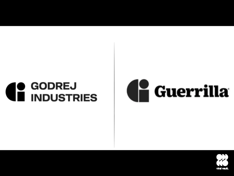
Parallels drawn with logos such as Guerrilla and even iD Fresh Food have pushed the conversation beyond one brand’s design choice. Instead, it has spotlighted a growing challenge in modern branding: as companies embrace minimalism, are they also inching closer to visual sameness?
Godrej’s response-that such similarities are “structural” and inherent to geometric design-is not without merit. After all, circles, rectangles, and clean lines leave limited room for differentiation. But that is precisely where the criticism finds its footing. If simplicity reduces distinctiveness, then the burden on execution and context becomes even greater.
The larger issue isn’t whether the logo is legally or ethically sound. It is whether it is memorable.
For a brand with over a century of legacy, subtlety may be strategic-but in today’s hyper-visible digital ecosystem, subtle can easily slip into forgettable. The real test for Godrej’s new identity will not be in defending its design, but in consistently building meaning around it.