



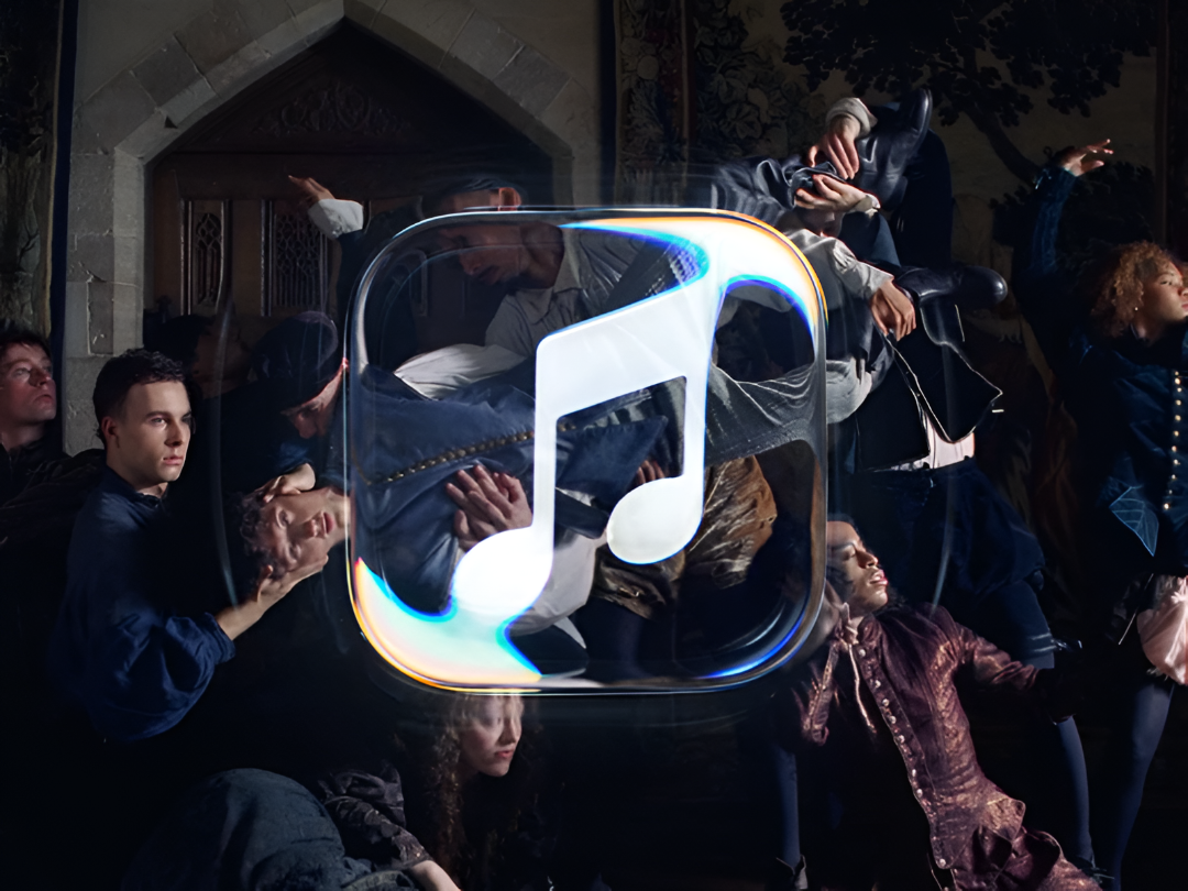
Apple Music has unveiled its most dramatic visual and sonic overhaul to date, built around a single idea: being “Made by Sound.” Instead of leaning on digital 3D rendering, the company chose a hands-on route, treating sound itself as the raw material of its new identity.
To get there, Apple worked with music producer Fred again, and sound design studio NEST Acoustics, through agency TBWA\Media Arts Lab. The team played audio frequencies through a transducer into a shallow bath of mineral oil resting over the Apple Music logo, then filmed the real ripples and refractions that formed on the surface. The result is a look shaped by physics rather than software.
The most visible shift is the exit of the service’s signature red. In its place is a stark black-and-white system, anchored by a bolder, rounder lowercase “music” wordmark paired with a custom version of Apple’s SF Pro typeface. The rippling liquid forms also connect directly to Liquid Glass, the design language Apple introduced across iOS and macOS.
A revised black-and-white app icon and the new design language have surfaced in iOS 27.2 betas. The identity is also rolling out across Apple’s website, original programming and events, including the Apple Music Hall venue in London.