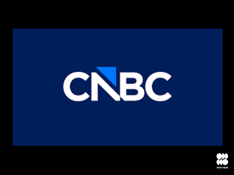
As the media landscape shifts, CNBC is rolling out a refreshed logo, part of its transition away from NBCUniversal under the newly formed Versant Media Group. The iconic peacock emblem, familiar since the mid-1990s, is being retired – replaced by a simpler, modern mark designed to usher in what the network calls “a new mark for our next chapter.”
Starting Saturday, December 13, 2025, the new logo will appear across all CNBC platforms, reflecting the network’s repositioning under Versant. While the name “CNBC” remains, the visual identity has been reimagined to align with its independent future.
Unlike the rebrand of sister network MSNBC (now renamed MS NOW), which changed both name and branding, CNBC is only updating its logo – maintaining continuity of identity while signalling a fresh strategic direction.
The new logo features a clean, streamlined design. The colourful peacock has been replaced by a stylised arrow – an upward symbol that echoes market movement and financial optimism, befitting a business-news channel. Industry observers note this change isn’t just cosmetic, but part of a broader repositioning as Versant prepares to go public and redefine its network identities.
As the peacock fades into memory, CNBC’s refreshed look aims to balance respect for legacy with readiness for the next phase. Only time will tell whether the new mark resonates as strongly as the old.