New identity reflects company’s AI-first evolution and unifies design across products
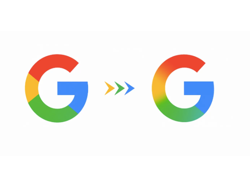
Google has unveiled a refreshed version of its iconic “G” logo, marking the company’s most significant design update in nearly a decade. The new look features a brighter gradient that blends Google’s signature four colors-blue, red, yellow, and green-into a more modern and dynamic identity.
First revealed in May within Google Search and the Gemini AI experience, the redesign is now extending to Gmail, Drive, Meet, Calendar, the Google app on Android and iOS, and even the Google Home logo. The unified visual approach reflects Google’s shift toward AI-powered experiences while ensuring consistency across its ecosystem.
According to the company, the refreshed design aims to capture both momentum in AI innovation and a stronger sense of creative energy. “This update represents our evolution as we build AI-powered experiences, while staying true to the foundational elements of our identity,” a Google spokesperson said.
For brands and marketers, the redesign carries notable implications:
- Visual consistency across Google products will simplify co-branding and third-party integrations.
- Positioning signal of AI leadership may enhance the appeal of Google-aligned campaigns.
- Design influence is expected, with gradients and colorful iconography likely to inspire broader industry trends.
The rollout of the brighter “G” is already underway, with full adoption across all major Google services expected by early 2026.