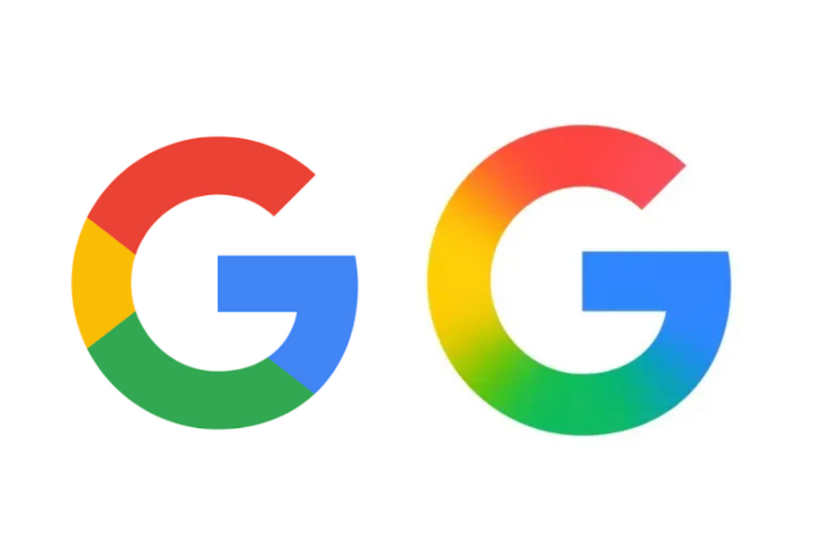
The refreshed logo aligns with Google’s AI-focused visual direction and Gemini branding.
For the first time in nearly 10 years, Google has updated its iconic ‘G’ logo, introducing a sleek gradient design that blends its signature red, yellow, green, and blue colors more fluidly. The new look represents a shift toward a modern, AI-inspired visual identity that ties in closely with Google’s Gemini and AI Mode in Search branding.
The refreshed logo is already rolling out across iOS and Pixel devices, and appears in version 16.18 (beta) of the Google app on Android. However, the familiar segmented ‘G’ remains visible on many Android phones and web platforms, signaling a phased rollout.
While the primary six-letter “Google” wordmark remains unchanged, this subtle redesign is part of a broader push to unify Google’s visual language across its expanding suite of AI-driven products. The new gradient style hints that other product icons – like Chrome, Maps, and Photos – may soon follow suit to maintain a consistent brand experience.
The company has yet to release an official statement on when the new logo will be adopted across all platforms.
This marks Google’s most significant logo update since September 2015, when the tech giant transitioned to its current sans-serif typeface – a move that signaled the brand’s mobile-first evolution. Today’s redesign reflects a similar moment: one that repositions Google as a leader in the AI-first era.


