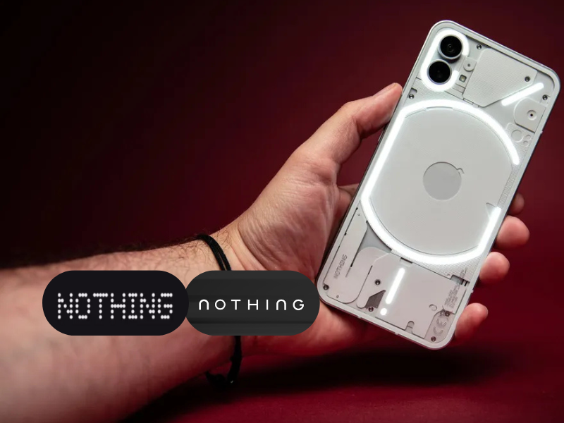
Consumer electronics brand Nothing has officially confirmed a major redesign of its logo, signaling a decisive shift away from the pixel-inspired visual identity that has defined the company since its launch. The announcement was made via a teaser post on X, where the brand shared two monochrome images revealing a new wordmark, accompanied by the statement, “Getting ready to make history.”
While the company has not disclosed the reasoning behind the redesign or whether it is part of a wider rebranding exercise, the visuals point to a cleaner, more traditional typographic approach. This marks a notable departure from Nothing’s distinctive dot-matrix and pixel-style branding, which helped the brand stand out in the competitive smartphone and audio markets.
Since its inception, Nothing has positioned itself as a design-first technology company, using unconventional aesthetics to build a strong visual identity. The apparent move toward a more restrained and mainstream logo could reflect the brand’s evolution as it scales its product ecosystem. With an expanding portfolio that includes smartphones, audio devices and its CMF sub-brand, a simplified wordmark may help create a more unified identity across categories.
The teaser has sparked mixed reactions online. Some observers view the change as a natural progression for a growing brand seeking broader appeal, while others worry that stepping away from the pixel-style logo could dilute Nothing’s uniqueness. Comparisons with other recent logo redesigns, including Jaguar’s updated identity, have also fueled debate around originality and direction.
Nothing has not yet announced when the new logo will be officially rolled out or how extensively it will be applied across platforms such as packaging, digital touchpoints and marketing assets. For now, the teaser stands as one of the most significant branding signals from the company since its founding, hinting at a strategic shift as Nothing enters its next phase of growth.


