Asian Paints Appoints Sudhir Sitapati as Independent Director
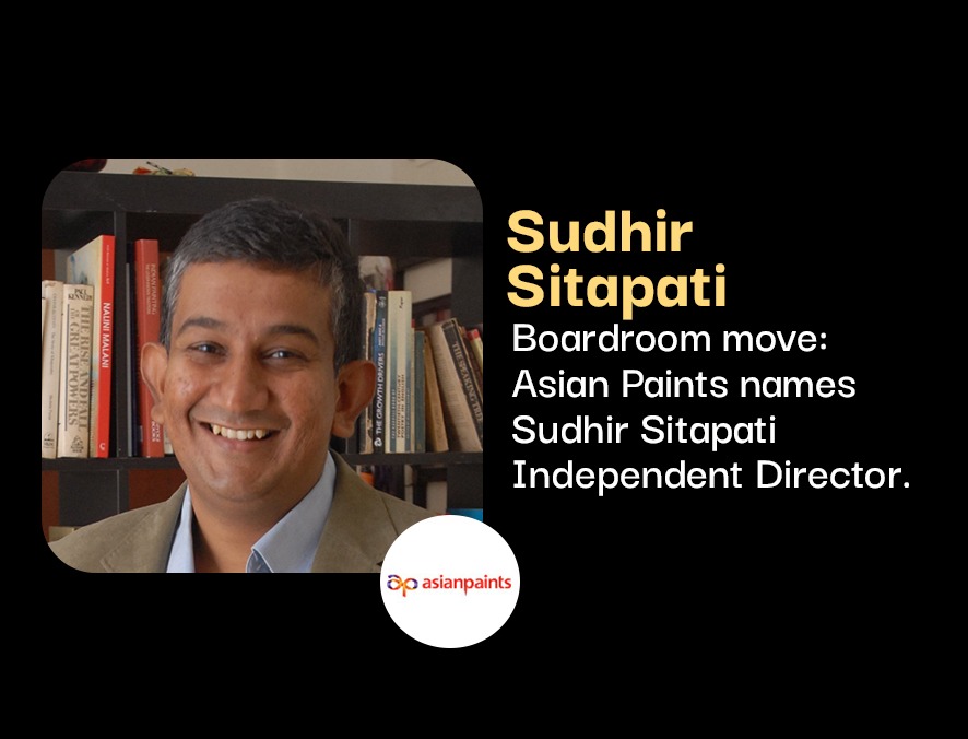
Asian Paints has appointed Sudhir Sitapati, Managing Director & CEO of Godrej Consumer Products, as an Independent Director following shareholder approval at its 80th AGM. The company also reappointed Milind Sarwate as an Independent Director for a second consecutive five-year term, reinforcing its board with experienced leaders from the FMCG, finance, and corporate governance sectors.