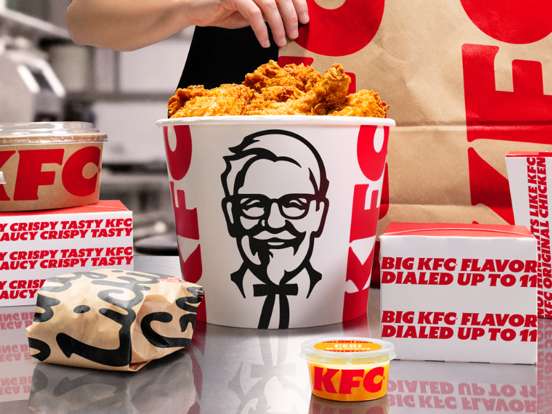
KFC has launched its most significant global rebrand in years, and the bucket is finally getting the spotlight it deserves.
Developed with creative agency Jones Knowles Ritchie, the refresh touches nearly every visual element – logo, typography, colour palette, Colonel Sanders himself – while building an entirely new brand architecture around what KFC calls the ‘Bucketverse’. The iconic red bucket, long a symbol of shared meals and Friday nights, is now the primary storytelling device across packaging, digital and print.
The logo gets a less flat, more dynamic feel. The Colonel loses his floating-head awkwardness in favour of a cleaner illustration. A secondary ‘Herbs and Spices’ colour palette joins the classic red, white and black, adding digital vibrancy without abandoning heritage. Custom kinetic typefaces – built for motion and optimised for mobile and digital menu boards – round out a system clearly engineered for a screen-first world.
But the rebrand extends well beyond visuals. KFC is leaning hard into boneless chicken, launching new tenders designed for solo snacking and dipping, backed by an expanded roster of over 20 sauces. Restaurant formats are evolving too – an open-concept store in McKinney, Texas and an immersive two-storey flagship in Dubai signal a shift from speed-focused layouts toward something closer to hospitality.
The rollout begins across digital touchpoints in the UK and Ireland, expanding to the US, Australia and other markets through the year.
Seventy-plus years in, the Colonel is still finding new ways to reinvent himself.