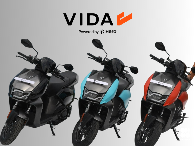
VIDA’s new logo isn’t really new – it’s Hero MotoCorp’s “H,” tilted 30 degrees and given a second stroke to call itself a “V.” And honestly, that’s the smartest thing about it.
Launched in 2022, VIDA deliberately built a standalone, startup-coded identity, distancing itself visually from its parent even while leaning on Hero’s engineering and dealer network. Four years in, that distance has clearly stopped paying off. The new geometric “V” lettermark – paired with “The VOOM,” a kinetic motion language and sonic signature meant to travel from motor to dashboard – pulls VIDA firmly back into Hero’s visual orbit.
Kausalya Nandakumar, Chief Business Officer of Hero’s Emerging Mobility unit, insists this isn’t a rebrand but an “amplification.” Fair enough on paper – the VIDA wordmark stays untouched. But symbolically, borrowing your parent company’s most recognisable asset and rebuilding your own identity around it is a rebrand in every way that matters to a customer.
And that’s arguably the right call. India’s EV buyer in 2026 isn’t chasing startup cool anymore – they’re chasing reliability, resale value and a name they trust with their money. A four-year-old EV brand with patchy service perception gains far more by visibly wearing Hero’s legacy than by insisting on manufactured independence.
With VX2, DIRT.E, NOVUS concepts and Zero Motorcycles collaborations already stretching VIDA’s portfolio, the logo change reads less like nostalgia and more like risk management – anchoring an ambitious, still-unproven EV bet to the one name Indian consumers already trust.