


Long before McLaren became a global motorsport and automotive powerhouse, its story began above a small family service station in Remuera, Auckland. That garage, owned by Bruce McLaren’s parents, Les and Ruth, is where a young Bruce built the car that took him to his first racing victory, and it’s now the inspiration behind McLaren’s most sweeping brand refresh yet.
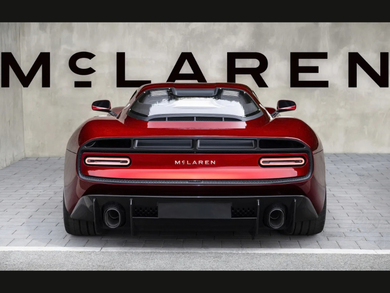
The company has unveiled an evolved identity uniting McLaren Automotive and McLaren Racing under a single visual language. At its heart is a new wide, uppercase sans-serif wordmark, replacing the sharper typeface used since 1981. Its most distinctive detail, a lowercase “c” raised to cap height and resting on an underline, is drawn directly from the 1920s signage that once hung above that Auckland garage.
The rebrand preserves the elements fans already recognise: the Speedmark remains central to the identity, and the Speedy Kiwi continues to honour Bruce McLaren’s New Zealand roots. Papaya orange stays the defining racing colour, now joined by an expanded palette that includes Midnight navy for the road car division.
David Woodhouse, Chief Creative Officer of McLaren Automotive, called it a reflection of the brand’s restless drive to push beyond expectations. Lou McEwen, Chief Marketing Officer of McLaren Racing, said the new identity bridges McLaren’s heritage with where it’s headed next, while staying true to Bruce’s original spirit.
The timing is deliberate: the new badging debuts on the manual McL 6GT, ahead of an upcoming performance SUV and the 2027 WEC Hypercar programme, alongside a £500 million investment in McLaren’s UK manufacturing footprint.