



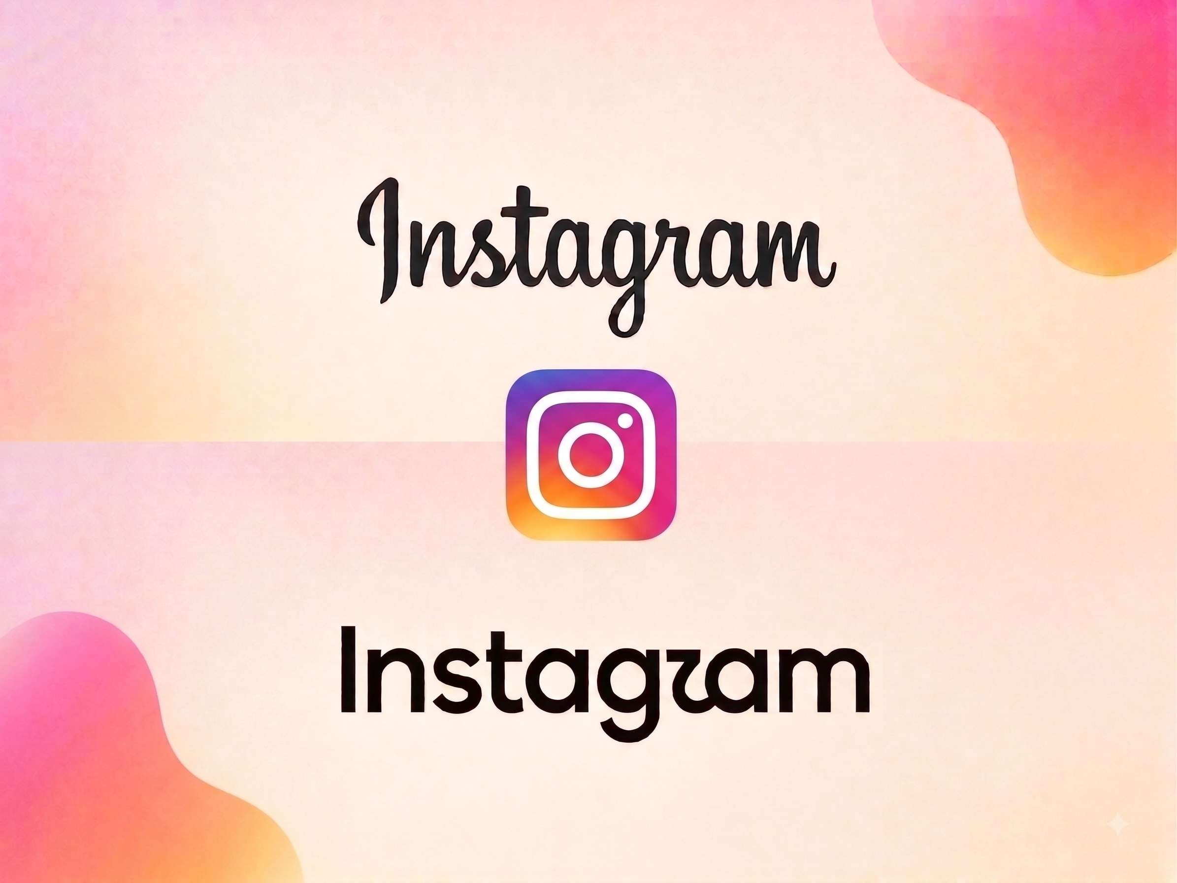
Instagram has updated its wordmark – the written “Instagram” that appears at the top of the app – for the first time in a decade. The app icon, the familiar pink-and-orange gradient square on billions of home screens, remains untouched.
The new type introduces cursive curves on the letters s, r and g, replacing the cleaner lines of the previous version. Head of Instagram Adam Mosseri said the wordmark hadn’t changed in ten years and it was time for a refresh, describing the result as “cleaner and more modern,” while still referencing the original design and the simplicity that has defined the brand. The update, announced by Meta, arrives alongside new Instagram fonts and design tools.
Reaction has been mixed. Some users welcomed the fresher look; others joked that the redesigned “r” resembles a boat sail, or that the wordmark now reads as “Instagzam.”
The last time Instagram touched its identity this significantly was 2016, when it dropped its skeuomorphic camera icon for the flat gradient square still in use today – a change that reflected the app’s shift away from being primarily a photo-sharing tool. This time, the update is narrower: Meta has declined to say whether a new app icon is coming.
That restraint may be the more telling detail. The icon, recognized by color and shape rather than text, carries far more brand equity than the wordmark, which shows up mainly in headers, marketing and press material. Whether the new curves hold up will likely come down to one simple test: legibility at thumbnail size, across every screen and language the app runs on.