Somany Ceramics has unveiled a refreshed brand identity, marking a significant step in its journey from a tile manufacturer to a comprehensive home and building solutions provider.
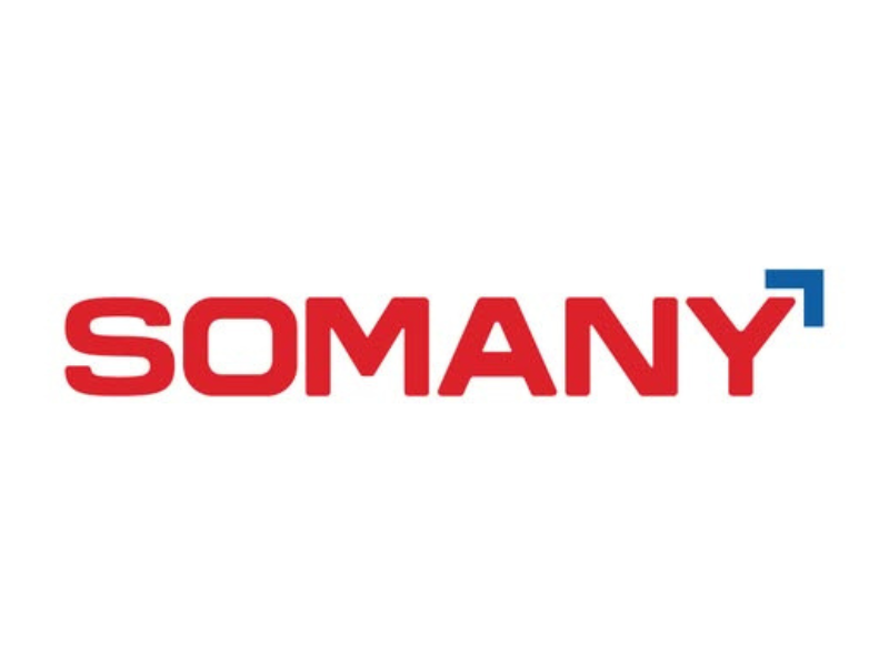
The new identity captures the company’s transformation over more than five decades, aligning with its expanded portfolio across tiles, bathware, and modern living solutions. At the center of this shift is a redesigned logo that moves away from rigid forms to softer, more fluid curves-mirroring contemporary architectural spaces while maintaining continuity with the brand’s legacy.
The updated visual language also introduces a refined colour palette. A stronger red signifies energy, scale, and confidence, while a blue arrowhead element represents direction and forward momentum. Together, these elements position the brand as modern, dynamic, and future-ready.
According to Managing Director and CEO Abhishek Somany, the rebrand reflects the company’s ongoing commitment to innovation, sustainability, and customer-centricity. It also signals a new phase of growth as the next generation of leadership takes the reins.
Beyond aesthetics, the identity shift reinforces SOMANY’s positioning as a one-stop destination for home solutions. The rollout will extend across retail spaces, packaging, digital platforms, and communication channels, aiming to create a more cohesive and engaging brand experience.
With this update, SOMANY is not just redesigning its logo-it is redefining how it presents itself in a rapidly evolving design and construction landscape.